
“I got a couple of rocks in a field. What does yours look like?” … I was imagining the conversation between my two daughters when in the mail they each received the postcards I had just painted on my trip to Scotland.

 Standing Stones of Ballymeanoch, Scotland (diptych)
The panoramic scene of the awe-inspiring ‘Standing Stones of Ballymeanoch’ (above) was too long for one postcard so I painted it as a diptych, sending half to each of the girls. I told them they’d have to get together for the FULL EFFECT of this alignment of megalithic monuments, aware that they are seldom jolted by the things I find most impressive. In fact, they had both done some research when they learned my sisters and I would be exploring these ancient sites near the Mull of Kintyre. And they were both quite pleased to have their own little paintings of the mystic standing stones.


 Lake Como and the Alps, Italy (triptych)
The idea of painting a diptych came to me when I realized that a wider than usual format was required to capture everything I wanted in the Scottish landscape. I needed even more scope for the magnificent view of ‘Lake Como and the Alps’ (above) that surrounded the Bed & Breakfast my husband and I found in Bellagio, Italy. So I put that on a triptych of three separate postcards – sent, of course, to three friends who knew each other and used my cards as an excuse to get together in my absence.
With a little artistic license it is possible to rearrange things, telescope the perspective, or even look around a corner! That’s what I did to create this view of London (below), composed from photos taken from a cruise boat on the Thames: by the time the boat gets past St. Paul’s and Tower Bridge, the Houses of Parliament have in fact disappeared around a bend in the river.
 Tower Bridge, London, England
Why Paint Postcards?
So, besides painter’s privilege of including exactly what you want in a picture, why paint your own postcards? There are several good reasons: Painted postcards are more personal – like a gift you can send someone special. You can tailor the content, and even the colors you use, to the recipient. When I painted Mt. Kirinyaga (below), there were all sorts of brilliant possibilities – flame trees, poinsettias, canna lilies – to contrast with the desolate moorlands surrounding the extinct volcano.
 Mt. Kirinyaga, Kenya
I selected the purple and orange canna lily foreground for my daughter’s card because those were the colors of her high school. (Some months later, she gently reminded me that the school colors had been changed to navy blue and orange because purple and orange together were just too awful).

Mountains of Guilin, China
You can adjust the painting technique for a specific recipient as well – the semi-abstract composition of the ‘Mountains of Guilin’ (above) isn’t suitable for just anybody. This particular postcard was further personalized by being stamped in red using a signature ‘chop’ purchased in Xi’an. My name in Chinese symbols is carved into it.

Triglav National Park, Slovenia
Many truly spectacular places just don’t have a good selection of postcards. Slovenia, which used to be part of Yugoslavia, is a case in point. In Triglav National Park, (above) they aren’t quite keeping up with the recent influx of travelers from western Europe, and the lack of good photographic postcards was a motivator to create my own.

Winter Storm-Watching, Vancouver Island, Canada
Sometimes pictures appropriate to the time of year can’t be found – a Fall postcard, for example, when all the cards feature springtime cherry blossoms. Also, storm clouds and wind-whipped water and trees are wonderful picture material, seldom regarded as suitable for tourism promotion. In any case, I think painting is better than photography for trying to capture an awesome winter day on the Pacific Coast of Canada (above).
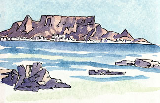
 Two Moods of Table Mountain, South Africa
Another weather phenomenon I enjoyed the challenge of painting rather than photographing crossed my path in South Africa. After a day spent on a winelands tour to Stellenbosch, Paarl and Fransschoek, we returned to the beach north of Cape Town where I painted several postcards of the classic view of Table Mountain – some with the clear skies we’d had all day, others with the characteristic thin layer of cloud that cascades over the mountains in the late afternoon. In the case of Table Mountain (above), it is, needless to say, nicknamed the Tablecloth.
Supplies are Easy to Buy and Carry
I suggest that any travelers with even a slight artistic inclination give postcard painting a try the next time they find themselves in a wonderfully paintable place. The supplies are not hard to come by, as most art supply shops carry stiff, postcard-sized, watercolor paper in blocks of 15 or 20, pre-printed with address lines. I recommend taking only one or two brushes and a very limited palette of five or six colors, plus a pencil and a couple of pens. And maybe some fluorescent markers – great for man-made objects and back-lit flowers. Your suitcase will hardly notice these slim additions.
Be warned, however – once you’ve sent people these special postcards, they’re going to expect nothing less every time you travel!
Born in the heart of Canada’s Rocky Mountains, Charlene Brown goes home to the mountains as often as possible. She spent most of her career writing research program evaluation reports in Canada’s capital city before moving to the Middle East in the 1990s. There she wrote a monthly art column for the Khaleej Times and a series of travel articles for the Gulf News. She and her husband now live in Victoria, British Columbia.
Charlene’s website is: charlenebrownpainting.blogspot.ca/. For another charming travel article in our collection illustrated with her paintings, please check out her “Vietnam in Watercolor”.
